Everyone is getting into making digital photo books. But, if you take a look at what's been done (see www.blurb.com and navigate to its bookstore) you'll appreciate that most of it is of a very uninspiring nature. No Photoshopping, no clear editing skills and poor design values. Here are some suggestions for your next book project.
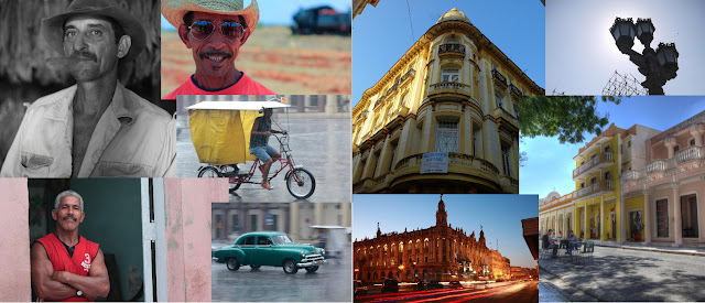 |
FREEHAND SCRAPBOOK style
I don't think this works because there are too many images, too close together and this makes it hard to identify where one image stops and the other starts. A bit too 'messy' for my liking. |
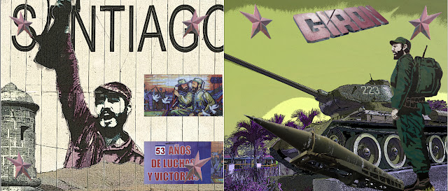 |
PHOTOSHOP SCRAPBOOK STYLE
This works far more effectively because everything has been selected and cut out of the background to create this scrapbook look. On top of that, most of the images have had heavy filter EFX added to them. Doing this needs considerable time and Photoshop skills to complete. |
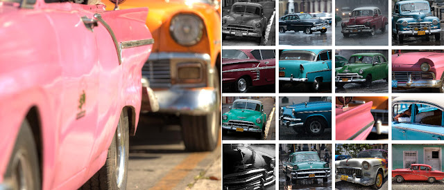 |
THE STANLEY GIBBONS STAMP ALBUM LOOK
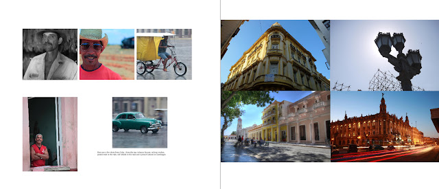
Always have a 'hero' shot on one page, then add smaller feature images to the other side to compliment the hero shot. That said, this is still a busy page! Many beginners pack their pages with 10, 15 or even 20 photos. Way too many - the book begins to look like a stamp album. |
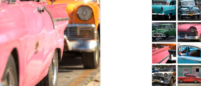 |
CREATE A HERO PAGE
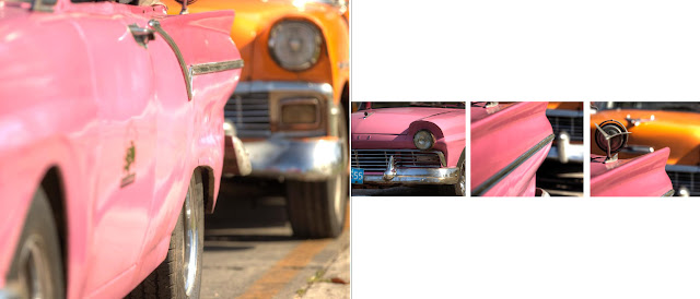
This is a better version of the page layout above. Isolate your 'hero' shot, find images that are bold, strong in colour (or black and white tones) and don't be afraid to use them BIG. I have created more white space by removing 50% of the images off the right-hand page. This creates a cleaner look to the layout. |
 |
SIMPLIFY YOUR DESIGN
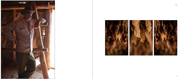
Another take on the same page - using a nine frame template - but only filling the middle three spaces to create this white space. |
 |
LESS IS MORE
Here's another take on the hero shot - with complimentary images echoing the topic on the opposite page. Note lots of white space. |
 |
DON'T DO THIS!
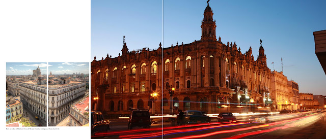
Easy to fall into this trap, adding images and image boxes at random. The result? A dog's dinner design that has no clear purpose and relation to the other images or captions on the page. For best results, simplify your design! |
 |
KEEP it SIMPLE
Don't fall into the trap of adding more and more images to each page. In fact, you could remove 50% of all pictures and create a far cleaner-looking design |
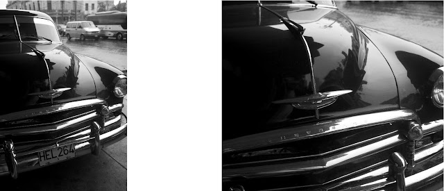 |
BIG is BEAUTIFUL
This DPS uses the same image twice at different positions and at different enlargements. Quite an effective technique for when you have a hot shot that you want to profile. |
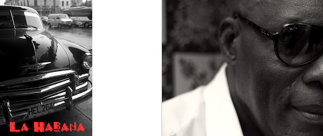 |
BIG is BEAUTIFUL 2
Big images, in this case I enlarged the images files to 200% to get this effect. Never be afraid to make the image go far larger than you think it should. Fill the page, add extra pixels if you get the yellow [resolution] warning from Blurb (adding more pixels is easy using Elements). I used a specialist FONT here (downloaded off the Internet at www.dafont.com to give the page more of a Cuban flavour. |
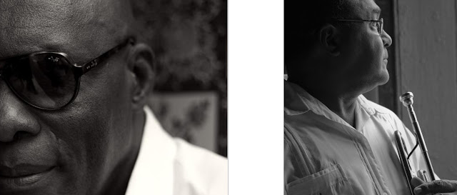 |
BIG is BEAUTIFUL 3
Flip the page and I have the same shot, but flipped, on the left-hand side for impact with another black-and-white muso shot to echo the mood on the RH page |
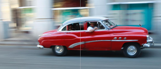 |
The DPS or TWO PAGE SPREAD
For me this is the perfect DPS (double page spread), stretching the image across two pages (you have to drag it into both pages, enlarge proportionally (usually 150%+) and push the LH image to the right and the RH image all the way to the left to get the two images to line up.
Guaranteed WOW factor |


No comments:
Post a Comment