These pictures are just some of the final images we finished up with at the end of the CCE/SCA Portraits Unplugged workshop held on the 4th and 11th June.
After an initial session where students were encouraged to use window light, on-camera speedlights and off-camera speedlight with diffusion we came out with some awesome images shot on location around the SCA campus. (top pic by Glenda Jennings, next two images by Michael Ho, below by Kerrie Dixon).
Many of the best images from the final day were produced by a technique of under-exposing the general metering and then filling-in the face with hand-held flash. This proved relatively easy because most of the students had sensibly brought along wireless flash triggers that they bought during the week. (below, pics by: Glenda Jennings, Glenda Jennings, Clare Hovey, David Chahoud, Clare Hovey, Jenelle Sanna, Bonnie Humphries, Bonnie again, David C, David C, 2 more from Glenda, 2 more from Jenelle, and a great study in motion by Kerrie D, who did the last two images. I hope I got the correct credits!).
Having just spent a fair amount of money on a Pocket Wizard system myself, I was a bit envious to find students using a $50 wireless trigger effectively (this is from China of course - availabler through a Sydney store called www.PhotoShopStudio.com.au). It worked pretty well though it's main drawbacks are range (maybe 40 foot) and that it only works with the camera set on manual metering mode. You certainly don't get full TTL metering like you do with the Pocket Wizard - but at that price it's actually cheaper than a camera sync cable ($89 from www.digitalcamerawarehouse.com.au).
This was one of the best portrait sessions we have held at CCE - as the results you see here attest - excellent work from all of the students...
Many thanks to models Zoe, Yana, Sarah, and Fabio for being so patient! And a special thanks to hair and make up artist, Connie Giaquinto, for helping us out on the day. Much appreciated (If anyone needs a good h & makeup artist, contact Robin).
Although I was quite happy producing a simple Blurb photo book with white pages and basic templates, I ended up producing a second book because I wanted something more 'Photoshop' and 'scrapbooking' than the clean lines and off-the-shelf production look a straight Blurb book produces.
All the pages in this A3-sized book (printed by Clickonprint.com.au) are multi-layered Photoshop files containing one or more photographs superimposed onto several textured layers over specially prepared, textured, background layers (with different backgrounds for the different book sections).
To get these visual effects I've used my own texture layers - these are nothing more than photos of ripped and crinkled bits of watercolour paper that have been cleaned up in Photoshop, converted to black-and-white and used as masks/overlays to create rough edges and textured picture surfaces.
Technique Number One: Breaking up the photo edge
The idea behind this is to create a rough-edged shape that can be used as a basis for a selection. Once the selection is made it's then applied to the actual picture on the layer above (or below) it. Press the Delete key to remove the outer parts of the photo which leaves an irregular (ripped paper) edge that you see in these examples.
Take a piece of watercolour paper, hand rip/tear off the edges all round, then screw the middle bit into a nice tight ball, then straighten it out on a flat surface as best you can. Then photograph it, sitting it on black card or velvet using nothing more sophisticated than an angled table lamp, so that you pick up some of the 3D qualities of the crinkled paper. Open the file in Photoshop, increase the highlight and shadow contrast (with Levels) to get a real black-and-white tone with some texture in the (white) middle part of the paper. Doing this makes it easy to select the crinkled paper only, usually with one click from the Magic Wand tool. A quick selection like this gives you an irregular-shaped selection line (because it follows the ripped paper edges). Open the mask image, select it all (Ctrl + A) and paste it into your 'master' page background (Ctrl + C, then Ctrl + V) and use the Move tool to shift it into place so that none of the rough edges bleed over the outside the picture layer. You might have to Transform the mask to get it to fit (Ctrl +T). With your mask in position above the photo layer, use the Magic Wand to select the black outer part of the mask. Once the selection is running, make your photo layer the active layer and press Delete. This removes all the pixels on the outside of the selection leaving you with an irregular shaped picture edge. I then added a drop shadow to the (now) ragged-edged photo layer to lift it off the master page background.
Technique Number Two: Adding Surface Texture
Because you used a piece of crumpled paper as a mask for selecting, then deleting the edges of your picture layer, don't forget that the white part of the mask layer has a texture across its surface. If we leave this mask layer in position (after deleting the irregular outer edges of the photo layer) we can change the Blend Mode (of that texture layer) so that the texture from the paper surface merges into the digital photo layer. In this example, the Multiply setting worked effectively, giving substantial texture on top of the photo layer. This might initially look a bit harsh to the eye, so reduce the opacity of your mask/texture layer (I'd try 30% but it could be anything depending on the image being used). You can also change the contrast of the mask/texture layer using Levels. Making the shadows blacker increases the contrast and gives you the appearance of more texture. Once you've done this you may have to go back and reduce the layer opacity further so the texture doesn't become overpowering.
The cool thing about using bits of ripped up paper as masks/textures is that you can resize them using a Transform action (Ctrl + T) at any time without fear of losing quality. In fact the whole point is that the process remains a bit random - to escape the predicable rectilinear edge we are so used to in photos.
Above: Here's another ripped paper 'mask', set to Multiply or to Hard Light modes - these seem to work well with this sort of image. I erased out the middle parts here leaving the textures around the edge of the shot only. In fact I did this on all the five texture layers so the main part of the real photo is not obscured at all - only the edges get roughed up and textured.
Here's the video, hosted at www.vimeo.com, explaining, I hope in clear English, how to add textures into your page designs. It's a bit long so bear with me. Press the four-arrowed symbol at the bottom of this video window to see it in the resolution it was saved in...
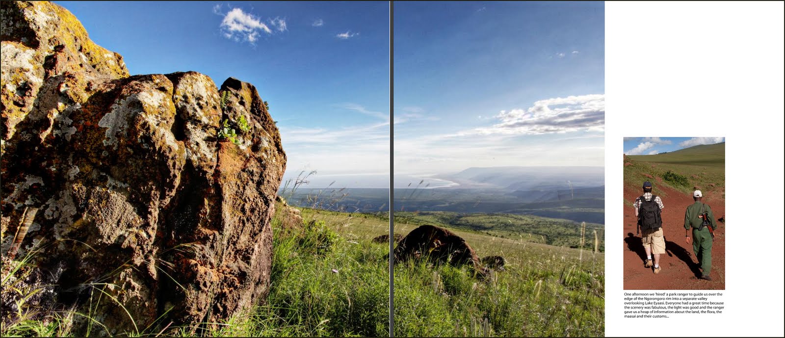
To see Robin's amateur video shot in Africa, see below...
Although this class is called, Portraits Unplugged, it's a bit of a mis-nomer because all the students had been actively using their Canon or Nikon speedlights to get some great results.
Held at Sydney University's Callum Park campus in Rozelle, this two-day class is resulting in some very impressive work. Day one saw us schlepping through the pouring rain in search of decent and yet dry locations within the college grounds to shoot our three models. Techniques learned on the day mostly revolve around getting the right aperture direct for the depth of field required and keeping a beady eye on the background. Something that most casual photographers completely miss while snapping families or friends. Above: Two from Clare Hovey. Below: First two from Bonnie Humphries, second group of two are from Glenda Jennings, third group (two images) are from Geoffrey Du and the last two are from Michael Ho. More to come once day two is completed...
Actually, I raced through this a little bit just so I could post it online so that you folks can have a look at what you can achieve. This is by no means my best effort, I could have spent a lot more time working on HD are and panoramic images are example, and photo shopping the bejesus out of all the images. I chose just to correct my mistakes, and inaccuracies made on the laptop, along with some final sharpening, before putting the book together.
As you can see in the BLURB preview above, one of the most important things is to break up the 'full page, full page, two images, full-page, full-page, two images' repetition I see in all the books posted in the Blurb online bookshop. This is because users simply choose a familiar template and run that again and again, through 100 or so pages. It gets boring after about 12 or 15, so:
Tip One: Break up your book with double-page spreads, stitched panoramas, and even by creating a different visual by flipping images from the left page to the right page. To do this, choose your shot, add it to a full left-hand page, then copy and paste it to the right-hand page. Select it (click on it once), then use the photo tools at the top of the Blurb page to flip the photo horizontally. You'll find some pictures look fantastic while others don't. You might have to fiddle around until you get the right combination. Doing this in between each section is a great way to put strong visual breaks into the book design. In the example here, I Cloned in extra trees and removed a few other things just to make the two identical but flipped pages look a bit less symmetrical. But not by much...
Tip Two: If you choose an image wrap book (this means the photo chosen for the cover is bonded onto the outside of the book with the edges wrapped round the) be careful not to have text/images too close to the edges. You need to keep important stuff at least one inch (2.5cms) off the edge as some cropping occurs when the cover is wrapped. I only discovered this AFTER I uploaded the darn book so had to redo the art then upload again. Another 600Mb upload. Tip Three: Another technique I used was to choose a suitable picture for a wide spread and duplicated it (here labelled 'AmboseliLeft.jpg' and 'AmboseliRight.jpg'. I extended the Canvas Size of Amboseli left by 50% using black, then used Photoshop's Gradient tool (set to a black-to-transparent gradient) to fade the newly-added black pixels on the left of the picture into the left-hand edge of the photo. It does not matter if the image ends up too wide because only the bit in the template window shows through. Load both into Blurb and drag both the LH and RH versions into the pages. Depending on the nature of the image, you then enlarge both using the Magnify tool at the top of the page, move the RH image as far left as possible and the LH image as far right as possible to reveal the graduated edge. If it is not fitting, enlarge the images more and try to re-align.
Tip Four: You can create a similar effect, but without the complexity of a gradation, by simply enlarging the images and moving them left and right so they bleed over the page. Only try this with photos that don't have essential details along the picture edges because some of the image will be lost.
Clickonprint books - More on working with Blend Modes later...
Here are some great results from last weeks studio and portrait session shot in and around Sydney College of the Arts (SCA) in Rozelle. The class had seven students and four models over two days of photography. We used a range of equipment, starting with a simple light stand and open reflector set up, before moving on to more sophisticated lighting using reflector boards, white transparent umbrellas and soft boxes. Later in the morning some of the group took the shoot outdoors, arming themselves with a single speedlight mounted onto a basic light stand but modified using either honeycomb grids or umbrellas.
Considering this was the first time most of the students had even seen a professional lighting setup, let alone used one, the results we achieved were outstanding. Top two shots by Chris Wilkins (using the new Orbis ringflash and a Canon 430EX speedlight). Next: Bonnie Humphries, Chris Wilkins, Bonnie, Linda Rowan, next two by Rob Marconi. Low key shots by Gordon Chirgwin, muscleman by GC, expression montage by Gary Russell, Linda, Kye Thompson, final two headshots also by Kye.
My thanks to John J, Fabio I, Sheila M, Jana and Sarah M for being such patient models.
Later in the week we'll be running a similar class using speedlights and natural light only. Watch out for the results from Portraits Unplugged.